Home / Blogs
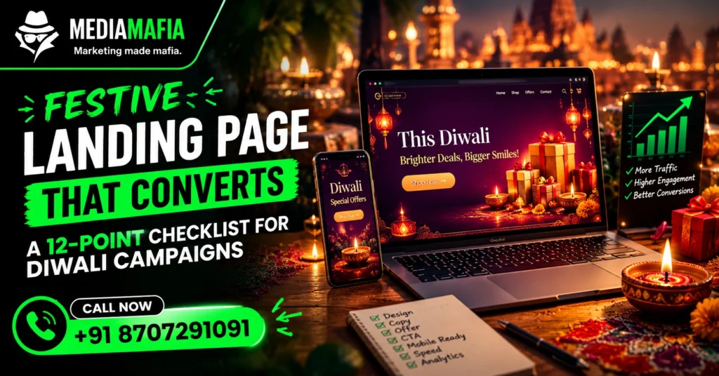
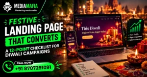
A festive landing page has one job: turn a click into an enquiry before the visitor changes their mind. Everything else on the page, from the colours to the footer, either helps that job or gets in its way. In our experience building pages for local businesses, the difference between a landing page that works and one that wastes your ad budget is rarely design talent. It is usually a handful of basic decisions made carefully.
This guide gives you a twelve-point checklist you can apply to a new page or to an existing one.
Quick answer: A festive landing page converts when it states one clear offer above the fold, loads fast on mobile, builds trust with real proof, and offers one obvious action such as a WhatsApp button or call button. It should also track every enquiry so you know which ad produced it.
A landing page is a single page built for one campaign and one action. It is not your homepage, and it is not your full website.
Your homepage serves many visitors with many goals. A landing page serves one visitor with one goal, which is why it converts better. When a visitor arrives from a Diwali ad, they expect to see that exact offer immediately. If they land on a general homepage, they must hunt for it, and most people will not.
Therefore, build one landing page per major offer. A jeweller might run one page for Dhanteras coins and another for bridal collections. A sweet shop might run one for corporate hampers and another for home delivery.
The first screen should state exactly what you are offering, to whom and by when. “Diwali gift hampers for offices, order by 1 November” works. “Welcome to our store” does not.
Put the offer in the headline, support it with one line, and show one image. Visitors decide in seconds whether the page matches what they clicked.
The page must continue the conversation your ad started. If the ad promises “free gift wrapping on Diwali hampers,” the headline should say the same thing. When ad and page disagree, visitors feel misled and leave.
Choose one action and repeat it. For most local businesses, it is “Message us on WhatsApp” or “Call now.” Do not add five buttons pointing five different ways.
Secondary links, such as your full website menu, distract visitors from the goal. Remove the navigation bar or keep it minimal.
In Uttar Pradesh, many customers prefer a chat to a form. Add a prominent WhatsApp button that opens a chat with a pre-filled message such as “Hi, I saw your Diwali hamper offer.” That small detail tells you which page the enquiry came from and saves the customer typing.
Keep the button visible while visitors scroll, especially on mobile. Also test it on both Android and iPhone, because broken links are a common and expensive mistake.
Most of your festive traffic will arrive on phones. Design for a narrow screen first, and then check the desktop version.
Use large tap targets, short paragraphs, readable text and enough spacing so that buttons do not collide. Test by loading the page on a real phone, on mobile data, not just on office Wi-Fi.
Speed directly affects conversions, because mobile visitors leave slow pages. Compress images, use modern formats such as WebP, avoid heavy sliders and remove scripts you do not need.
Google’s documentation on Core Web Vitals explains the loading, interactivity and stability measures that describe page experience. Aim for a largest contentful paint under 2.5 seconds, a layout shift below 0.1 and responsive taps.
Trust decides whether visitors act. Include proof that only a genuine business can provide:
Avoid vague praise like “Trusted by thousands” unless you can back it up. Unproven claims reduce trust instead of building it.
Hidden prices create suspicion. If you can show prices, show them. If prices vary, show a “starting from” figure or a range, and explain what affects the final cost.
Customers who see a price and still enquire are far better leads than customers who enquire only to find out the price.
Festive offers naturally have deadlines, such as last order dates for delivery. State them plainly: “Order by 2 November for delivery before Diwali.”
However, avoid fake countdown timers that reset on every visit. They damage credibility, and some ad platforms treat misleading urgency as a policy problem.
If you need a form, ask for the minimum: name, phone number and one qualifying question. Every additional field loses some visitors.
Make sure the form confirms submission clearly, and send a quick follow-up on WhatsApp or by phone. A form that never gets answered is worse than no form.
Visitors hesitate for predictable reasons. Answer them directly on the page, in a short FAQ:
Real questions from your own customers make the best FAQ. This also helps search engines and AI answer tools understand the page.
You cannot improve what you do not measure. Set up:
We cover how to turn this data into decisions in ad campaign reporting for the festive season.
Here is a simple structure that follows the checklist.
Keep the whole page short. A visitor from a Diwali ad wants to confirm that you have what they need and that you are trustworthy, and then contact you.
Sending ads to the homepage. This is the most common and the most expensive error. Build a dedicated page.
Too many choices. Every extra link or button reduces the share of visitors who take the main action.
Stock photos of smiling strangers. Customers recognise them, and they weaken trust. Use your own photography.
Ignoring the thank-you step. After someone enquires, confirm it, set expectations and reply fast.
Never testing. Change one element at a time, such as the headline or the button text, and compare results. Small tests compound over a season.
A landing page built for ads can also support organic visibility if you handle the basics.
If you need help building pages like this, see our web design services in Varanasi or our web development team.
Run through this list the day before your campaign goes live.
It is a single page built to turn visitors from a festival campaign into enquiries or sales. It focuses on one offer and one action.
Not always. Click-to-WhatsApp ads can open a chat directly. However, a landing page helps when the product needs explanation, price details or proof before the customer will message.
As long as it needs to answer the visitor’s questions and no longer. For most local offers, a short page with the structure above is enough.
Aim for the Core Web Vitals targets: a largest contentful paint under 2.5 seconds, an interaction response under 200 milliseconds and layout shift below 0.1.
You can reuse the structure and the proof. Update the offer, dates, images and prices, and only change the “last updated” date when you genuinely update the content.
A festive landing page does not need to be fancy. It needs one clear offer, fast loading, real proof, an obvious action and tracking that tells you what worked. Work through the twelve points, test before launch and improve week by week.
To get a page built for your own campaign, contact our team. To see how the page fits into a full campaign, read our guide to festive ads packages and our comparison of Meta ads vs Google ads.